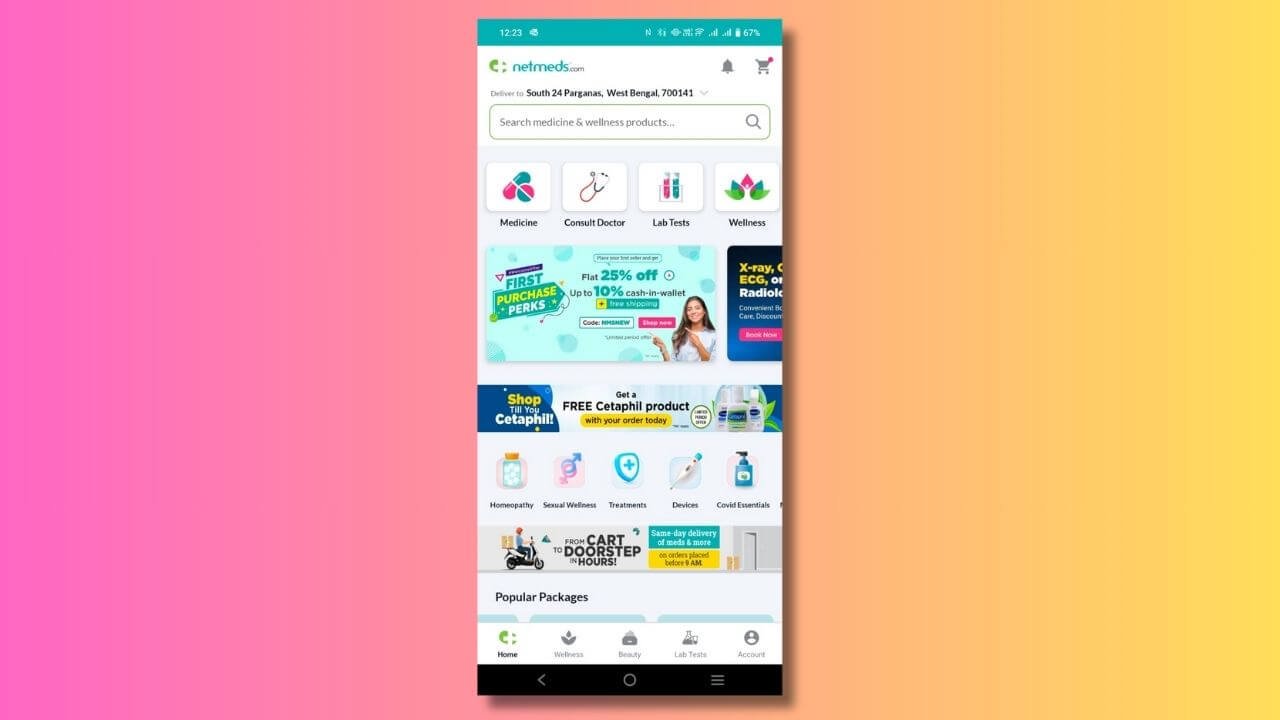
About the client
Netmeds is India’s leading online pharmacy offering a vast range of medicines, medical equipment, healthcare, lifestyle, fitness, and non-medical products. Netmeds earlier had a slightly unclear UX copy in the signin/signup journey. In this case study you will know about how Netmeds has improved the user experience with a clear and concise copy during the onboarding journey.
The challenge
The sign-in and signup journey is an essential part of UX design. Besides the design, the UX copy has to be informative yet precise to guide the user while logging or creating an account.
1) Lack of clear UX copy: The earlier copy was something like: ‘Sign in to Nemtdes to view addresses and more.’ Also, there was no step-wise guide for the users across the onboarding journey. Now, is an app just for that? Can’t we tell the users the benefits of having a Netmeds account? Like ordering medicines right from home, quick delivery, offers, etc. These were some questions that were raised with the stakeholders.
2) No error texts: Error texts were missing which could guide users to complete journeys successfully.
3) Lack of proper labels and CTAs: Labels and CTAs were not correctly named.
4) Long sign-in process: Earlier it was a 3-step sign in process.
So, besides UX improvements, the Netmeds team decided to revamp the copy as well along with the UI and design.
Objectives
Signin and signup journeys are important as a user has to log in to an app to order products. So, it is important to have clear instructions mixed with highlighting the USPs on the login screen. So, the objective was to blend simplicity with creativity while strategizing the UX copy.
1) Clear instructions: Create a clear and precise copy that guides users to take action.
2) Highlight USPs of the app: Collaborate with the Netmeds team to figure out USPs and implement them in copy.
3) Curate empathetic helper and error texts: Empathize with the user and guide them with crisp UX copy.
4) Create actionable CTAs: Clear CTAs guide users to take the right action at every step to complete the sign/signup.
The approach
Here’s how I approached the problem and solved it with a crisp UX copy.
1) Briefing phase: Conducted interviews with the Netmeds team and benchmarked with the competition to understand the target audience and current pain points.
2) Collab: I collaborated with the Marketing and Product Teams to finalize the content. This step includes brainstorming to finalize the sign-in/signup process, as the UI and content will be centered on that. For example:
a) How many steps will it take to sign in/sign up?
b) Will the process involve an OTP verification through mobile or email, or providing users with both options?
c) How can the steps be minimized and the process hassle-free for the users?
3) Crisp UX copy for the journey: Crafted copy focusing on the easy-to-understand language and the USPs of the app. For example: Why should you sign in Netmeds? It offers a wide variety of medicines, healthcare, and fitness products.
4) Helper texts and error texts: Crafted clear and empathetic copy for helper and error texts so that users can complete the journey.
5) Created actionable CTAs: Created crisp CTAs enabling users to complete each step successfully.
6) Shortening the sign-in journey: Earlier it was a 3-step sign-in process. But now brought it down to 2 steps by providing an option to enter a phone number in the sign-in journey’s landing screen itself. This would expedite the process.
7) UAT: Post-replicating copy in the final design prototype, I tested them extensively to iterate and refine the copy further.
Key deliverables
1) Crafted UX copy for the journey: Jio stands for empathy, joy, and care, which is reflected in the voice and tonality of its content. So, I crafted a subtle copy for the sign-in/sign-up journey that aligns with Jio’s values and is based on industry best practices.
For example, in error scenarios, I crafted empathetic messages guiding the users to do things correctly without criminalizing them. If there is an incorrect OTP error, I crafted something like: ‘This OTP is not valid. Please enter the correct code to proceed!’
2) Tested copy in design
UX writing requires crisp and concise copy that fits within the given space and character count. After crafting the first draft, I tested the same in the design prototype to refine the copy further.
Here is the final copy!
Signin UX copy


Signup copy

Impact
The enhanced UX copy resulted in:
1) Increased signin rate: Up by 10%
2) Increased signup: Up by 12%
Conclusion
By crafting simplified and empathetic Netmeds UX copy, for the signin/signup journey, the brand can now offer an improved user experience. This has led to more sign-ups and increased visits to the app. Crafted by Sandip have been able to address the issues successfully.
In case you are also looking to establish your brand with UX copy that talks your story:
